import pandas as pd
import numpy as np
read in some data
filename = "data/percent-bachelors-degrees-women-usa.csv"
data = pd.read_csv(filename, usecols=['Year','Computer Science','Physical Sciences','Health Professions','Education'])
data.head()
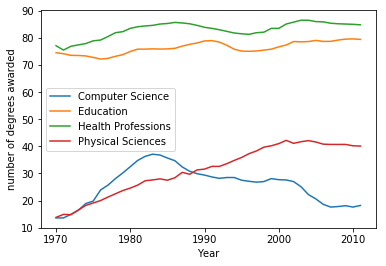
| Year | Computer Science | Education | Health Professions | Physical Sciences | |
|---|---|---|---|---|---|
| 0 | 1970 | 13.6 | 74.535328 | 77.1 | 13.8 |
| 1 | 1971 | 13.6 | 74.149204 | 75.5 | 14.9 |
| 2 | 1972 | 14.9 | 73.554520 | 76.9 | 14.8 |
| 3 | 1973 | 16.4 | 73.501814 | 77.4 | 16.5 |
| 4 | 1974 | 18.9 | 73.336811 | 77.9 | 18.2 |
import matplotlib.pyplot as plt
First we extract the numpy arrays holding the data
years = data['Year'].values
physical_sciences = data['Physical Sciences'].values
computer_science = data['Computer Science'].values
education = data['Education'].values
health = data['Health Professions'].values
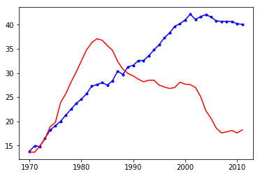
# % of degrees awarded to women in the Physical Sciences
plt.plot(years, physical_sciences, color='blue', marker='.')

# % of degrees awarded to women in Computer Science
plt.plot(years, computer_science, color='red')

# Display the plot
plt.show()
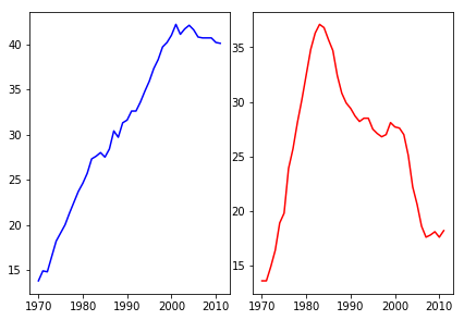
Make 2 plots side by side
# plot axes for the first line plot
plt.axes([0.05, 0.05, 0.425, 0.9])

# % of degrees awarded to women in the Physical Sciences
plt.plot(years, physical_sciences, color='blue')

# plot axes for the second line plot
plt.axes([0.525, 0.05, 0.425, 0.9])

# % of degrees awarded to women in Computer Science
plt.plot(years, computer_science, color='red')

# Display the plot
plt.show()
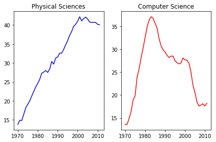
# Create a figure with 1x2 subplot and make the left subplot active
plt.subplot(1,2,1)

# % of degrees awarded to women in the Physical Sciences
plt.plot(years, physical_sciences, color='blue')
plt.title('Physical Sciences')

# Make the right subplot active in the current 1x2 subplot grid
plt.subplot(1,2,2)

# % of degrees awarded to women in Computer Science
plt.plot(years, computer_science, color='red')
plt.title('Computer Science')

# Use plt.tight_layout() to improve the spacing between subplots
plt.tight_layout()
plt.show()
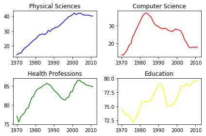
# Create a figure with 2x2 subplot layout and make the top left subplot active
plt.subplot(2,2,1)

# Plot in blue the % of degrees awarded to women in the Physical Sciences
plt.plot(years, physical_sciences, color='blue')
plt.title('Physical Sciences')

# Make the top right subplot active in the current 2x2 subplot grid
plt.subplot(2,2,2)

# Plot in red the % of degrees awarded to women in Computer Science
plt.plot(years, computer_science, color='red')
plt.title('Computer Science')

# Make the bottom left subplot active in the current 2x2 subplot grid
plt.subplot(2,2,3)

# Plot in green the % of degrees awarded to women in Health Professions
plt.plot(years, health, color='green')
plt.title('Health Professions')

# Make the bottom right subplot active in the current 2x2 subplot grid
plt.subplot(2,2,4)

# Plot in yellow the % of degrees awarded to women in Education
plt.plot(years, education, color='yellow')
plt.title('Education')

# Improve the spacing between subplots and display them
plt.tight_layout()
plt.show()
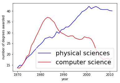
# % of degrees awarded to women in the Physical Sciences
plt.plot(years, physical_sciences, label='physical sciences', color='blue')

# % of degrees awarded to women in Computer Science
plt.plot(years, computer_science, label='computer science', color='red')

# Display the plot
plt.legend(fontsize=20)
plt.xlabel("year")
plt.ylabel('number of degrees awarded')
plt.show()
data.plot(x="Year")
plt.ylabel("number of degrees awarded")
plt.show()