from PIL import Image
import requests
from io import BytesIO
from matplotlib.pyplot import imshow
import matplotlib.pyplot as plt
import numpy as np
%matplotlib inline
First we start with understanding a neuron and then move to layers.
Lets think of a simple classification example. When we look at three images we’d like to know if they depict sand, grass or ice.
First lets load in some images.
response = requests.get("https://australiaphysicalfeatures.weebly.com/uploads/2/6/4/9/26494769/4939417.jpg?391")
sand = Image.open(BytesIO(response.content))

response = requests.get("https://upload.wikimedia.org/wikipedia/en/2/27/Bliss_%28Windows_XP%29.png")
grass = Image.open(BytesIO(response.content))

response = requests.get("https://cdn.britannica.com/s:300x500/47/170747-131-D1FB7019.jpg")
ice = Image.open(BytesIO(response.content))
fig=plt.figure()
f, (ax1, ax2, ax3) = plt.subplots(1, 3, figsize=(12, 4))
ax1.imshow(np.asarray(sand))
ax2.imshow(np.asarray(grass))
ax3.imshow(np.asarray(ice))
<matplotlib.image.AxesImage at 0x7f288a214588>


<Figure size 432x288 with 0 Axes>
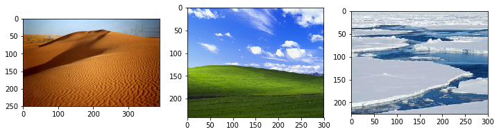
Now we can classify them.
def averageChannels(P):
  return np.asarray(P).mean(axis=(0,1))

def classifyPicture(P, t1, t2, t3, t4, t5):
  theta_r, theta_g, theta_b = averageChannels(P)
  if theta_r > t1 and theta_g > t2 and theta_b > t3:
    return "Ice"
  elif theta_g > t4:
    return "Grass"
  elif theta_r > t5:
    return "Sand"
  else:
    return "Unknown"
we set simple thresholds that determine if the average colour of an image is red green or white enough.
classifyPicture(grass, 100, 100, 100, 100, 100)
'Grass'
how do we set the thresholds? with data! I went through the three examples here and worked out that 100 was good enough for these three examples but its very unlikely these will work for all images of sand grass or ice. This gets even more complicated when we wish to move to more classes like city, corn field, lake, ocean etc
An artificial neural network takes a layer of inputs and processes them through a series of nodes. these nodes are called neurons. The final layer has a designated number of outputs. In our case above we have only one output the class Y.

each neuron in each layer connects to those in the layer before it and provides an output to those in the layer after it.
Each neuron takes in inputs and weights them to produce a response. eg in our above example we take the r,g,b values.
since there is a weight for each input we express these as linear algebra dot products $\langle a,x\rangle$.
now the weights $a$ and bias $b$ are parameters of the model like the thresholds from before. These are what we want to learn such that $y$ gives us a good separation between our classes or approximation of the function in question.
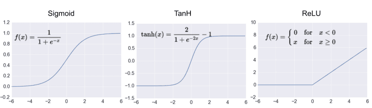
$\sigma$ is the activation function and is designed to normalise the function to between some values usually giving binary on or off answers.
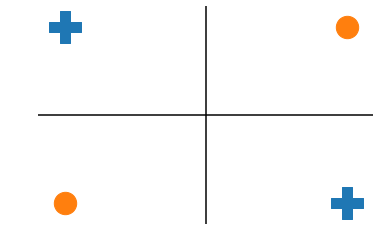
we want pluses in active region for the neuron, and the circles on the other. You cant draw a line that does that.
pluses = ([-1,1],[1,-1])
minuses = ([-1,1],[-1,1])
fig, ax = plt.subplots()
ax.scatter(*pluses,marker=('P'),s=1000)
ax.scatter(minuses[0],minuses[1],marker=('o'),s=500)
ax.axis('off')
ax.axhline(y=0, color='k')
ax.axvline(x=0, color='k');
So for our two inputs we add two nodes: $y^1_1$ and $y^1_2$
fig, ax = plt.subplots()
ax.scatter(*pluses,marker=('P'),s=1000)
ax.scatter(minuses[0],minuses[1],marker=('o'),s=500)
ax.axis('off')
ax.axhline(y=0, color='k')
ax.axvline(x=0, color='k')
line_1 = plt.Line2D([-.5,1.5], [1.5,-.5])
ax.add_line(line_1)
plt.text(-.4,1.2,r"y$^1_1$")
line_2 = plt.Line2D([-1.5,.5], [.5,-1.5])
ax.add_line(line_2)
plt.text(-1.2,.4,r"y$^1_2$")
Text(-1.2, 0.4, 'y$^1_2$')
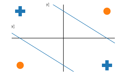
by combining these two neurons gives a response that is active for both plusses but neither circle.
remembering the formula for a single neuron: we can stack this formula for multiple neurons:
so the output of a layer is now a matrix operation of all weights times all inputs plus all weights. This is the type of operation that goes very quickly on a GPU.
To learn the weights we need two alorithms, Stochastic Gradient Descent (SGD - more than just a society of data)
We need to tell our network what the goal is. To do this we use a loss function.
where $f$ is the prediction of your model given a data set and $y$ is the ground truth or label.
For example back to the sand,grass, ice example $f$ is the result of running classifyPicture on some image with some thresholds, if the thresholds return ice on a picture of ice they give zero loss but if they return grass or sand on a picture of ice theyd get a high loss and we’d run again with different thresholds. By running on lots of images we can get a good set of thresholds and pick the one that has the best accuracy over all images.
In the example of the dots and plusses we wanted a line that kept as many plusses below the line whlist keeping as many dots above it, but in the case of regression we want a line that is as close to all of the points as possible.
This means we need to modify the above formula:
here $\theta$ are the model parameters. eg the thresholds in our example. The $\frac{1}{n}\sum_{i=1}^n$ segment just says that we average over the training set.
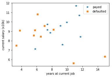
Here we generate some random data. 20 customers based on time in thier current job and current anual salary. 10 defaulted on thier morgage and 10 did not.
def generateGoodPeople():
  good_mean = [10,10]
  good_cov = [[6, 0], [0, 6]]
  return np.random.multivariate_normal(good_mean, good_cov, 10).T
def generateBadPeople():
  bad_mean = [6,8]
  bad_cov = [[6, 3], [-6, 8]]
  return np.absolute(np.random.multivariate_normal(bad_mean, bad_cov, 10).T)
x1, y1 = generateGoodPeople()
x2, y2 = generateBadPeople()
plt.plot(x1, y1, '*', label="payed")
plt.plot(x2, y2, 'X', label="defaulted")
plt.xlabel("years at current job")
plt.ylabel("current salary (x10k)")
plt.legend()
plt.show()
/usr/local/lib/python3.6/dist-packages/ipykernel_launcher.py:8: RuntimeWarning: covariance is not symmetric positive-semidefinite.
assuming cut offs our loss would be as such:
plt.plot(x1, y1, '*', label="payed")
plt.plot(x2, y2, 'X', label="defaulted")
plt.xlabel("years at current job")
plt.ylabel("current salary (x10k)")
plt.axhline(y=8, color='k')
plt.show()
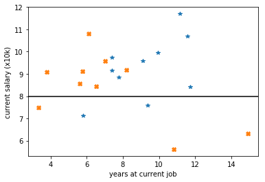
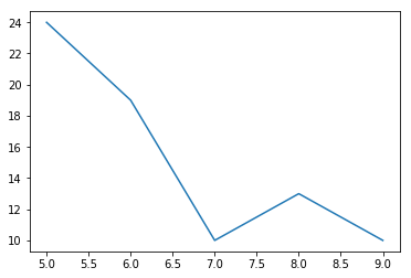
by requiring applicants earn at least 80k PA gives:
plt.plot(x1, y1, '*', label="payed")
plt.plot(x2, y2, 'X', label="defaulted")
plt.xlabel("years at current job")
plt.ylabel("current salary (x10k)")
plt.axhline(y=9.2, color='k')
plt.show()
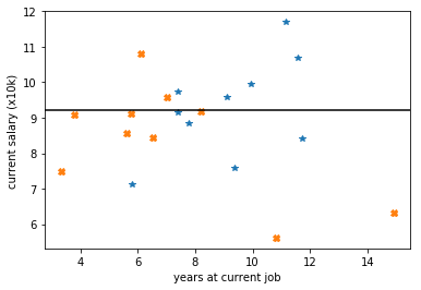
by requiring that applicants earn 92k this loss becomes +11 but cutting instead on the years at 7.6 would give a loss of only 9!
def score(xcut,ycut):
  g = 0
  h = 0
  for i,j in zip(x1,y1):
    if i < xcut:
      g += 1
    elif j < ycut:
      g += 1
  for k,l in zip(x2,y2):
    if k > xcut and l > ycut:
      h += 3
  return g+h
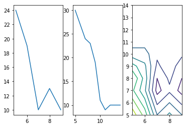
fig=plt.figure()
f, (ax1, ax2, ax3) = plt.subplots(1, 3)
xes = [score(i,0) for i in range(5,10)]
ys = [score(0,i) for i in range(5,15)]
zx,zy= np.meshgrid(range(5,10),range(5,15))
t = np.vectorize(score)
z = t(zx,zy)
ax1.plot(range(5,10),xes)
ax2.plot(range(5,15),ys)
ax3.contour(range(5,10),range(5,15),z)
<matplotlib.contour.QuadContourSet at 0x7f2885ea86d8>


<Figure size 432x288 with 0 Axes>
In practice for classification tasks its common to use a loss function called the Binary Cross Entropy or the log loss as explained below and described as:
def binary_cross_entropy(targets, predictions):
    eps = 1e-15
    predictions[predictions == 0] += eps
    N = predictions.shape[0]
    ce = -np.sum(targets*np.log(predictions)+(1.+eps-actual)*np.log(1.+eps-predictions))/N
    return ce

# this can alse be taken from scikit-learn
from sklearn.metrics import log_loss
Here we need to encode our simple cut based model into classes, both for actual and predicted.
def predict(x,y,xcut,ycut):
  dx = x - xcut
  dy = y - ycut
  d = np.sqrt(dx*dx + dy*dy)
  bool_x = dx > 0
  bool_y = dy > 0
  sign = -1.*(bool_x * bool_y)
  sign[sign == 0] = 1.
  d = d * sign
  d = d/(d.max()-d.min())
  d -= d.min()

  return d

# [sqrt(pow(i-xcut,2)+pow(j-ycut,2)) for i,j in zip(x,y)]

actual = np.hstack([np.ones(10),np.zeros(10)])
pgood = predict(x1,y1,6,9.2)
pbad = predict(x2,y2,6,9.2)
predicted = np.hstack([pgood,pbad])
print(binary_cross_entropy(actual, predicted))
print(log_loss(actual, predicted))
4.170165378604001
4.175433404386888
x = np.array([True, False, False])
y = np.array([True, True, False])

x*y
array([ True, False, False])
fig=plt.figure()
f, (ax1, ax2, ax3) = plt.subplots(1, 3)
xes_bce = [log_loss(actual,np.hstack([predict(x1,y1,i,0),predict(x2,y2,i,0)])) for i in range(5,15)]
ys_bce = [log_loss(actual,np.hstack([predict(x1,y1,0,i),predict(x2,y2,0,i)])) for i in range(5,15)]
zx,zy= np.meshgrid(range(5,15),range(5,15))
z_bce = np.zeros([10,10])
for i in range(5,15):
  for j in range(5,15):
    z_bce[i-5,j-5]= log_loss(actual,np.hstack([predict(x1,y1,i,j),predict(x2,y2,i,j)]))
ax1.plot(range(5,15),xes_bce)
ax2.plot(range(5,15),ys_bce)
ax3.contour(range(5,15),range(5,15),z_bce)
<matplotlib.contour.QuadContourSet at 0x7f287b2eeac8>


<Figure size 432x288 with 0 Axes>
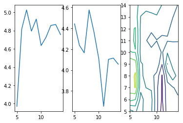
let us take another look at that last plot. It depicts the function of our loss in one dimension.
plt.plot(range(5,10),xes);
if we were the slope of this function can be seen as the “negative of the gradient in x of f(x)” which is expressed as $-\nabla_xf(x)$ This is the direction of steepest descent. SGD does this in several steps and averages them.
In this case $n$ might be very large and $f$ can be very very complex. By averaging the the gradient of steps we can overcome the massively large $n$. Back propagation solve the second issue of complex functions by providing a method for speeding up the calculation of the gradient through the application of the chain rule. In doing so the number of caluclations that need to be taken can scale linearly with the number of nodes not the exponent.
Here we put everything together. Several nodes are arranged in layers to produce a function, the loss of the network is defined, an optimiser is commisioned and the weights propagated back.
First we import the pytorch libraries:
import torch
import torch.nn as nn
import torch.optim as optim
Next we define our model. Here we use a single hidden layer. Our two inputs (salary and years in current job) connect to 50 nodes in the hidden layer with a Rectified Linear Unit (ReLU) activation function then passed to the output node which produces a sigmoid prediction as being likely to pay back a morgage or not.
We also define our optimiser as being SGD and our loss as being the Binary Cross Entropy.
h = 50
net = nn.Sequential(
  nn.Linear(2,h),
  nn.ReLU(),
  nn.Linear(h,1),
  nn.Sigmoid()
)

optimizer = optim.SGD(net.parameters(),lr=0.1)
loss_fn = nn.BCELoss()
Now we just put our data in a form that pytorch likes to deal with.
xi = np.hstack([np.vstack([x1,y1]),np.vstack([x2,y2])]).T
X = torch.Tensor(xi)
y = torch.Tensor(actual)
Now we run the network. Each pass of the network we update our prediction by steping the optimiser forward and propagating the gradients back.
the value of the loss every 20 attempts is printed.
for epoch in range(100):
  optimizer.zero_grad()
  output = net(X)
  loss = loss_fn(output, y)
  if epoch % 20 == 0:
    print("epoch :{}, loss at {:.2}".format(epoch, loss.item()))
  net.zero_grad()
  loss.backward()
  optimizer.step()
epoch :0, loss at 0.89
epoch :20, loss at 0.39
epoch :40, loss at 0.33
epoch :60, loss at 0.31
epoch :80, loss at 0.34


/usr/local/lib/python3.6/dist-packages/torch/nn/modules/loss.py:512: UserWarning: Using a target size (torch.Size([20])) that is different to the input size (torch.Size([20, 1])) is deprecated. Please ensure they have the same size.
  return F.binary_cross_entropy(input, target, weight=self.weight, reduction=self.reduction)
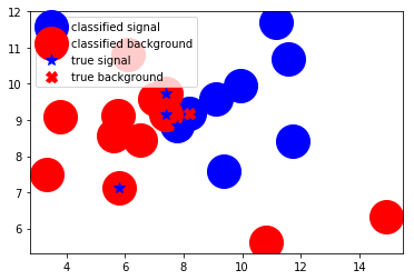
Now all we need to do is use the network to predict the class (shall we offer this person a morgage or not) if you can see a shape on the circle it has been misclassified. So we can see that only 1/4 of the events are misclassified.
target = np.array([net(X)[i].item() for i in range(20)])
tx = np.hstack([x1,x2])[target>.7]
ty = np.hstack([y1,y2])[target>.7]
px = np.hstack([x1,x2])[target<.7]
py = np.hstack([y1,y2])[target<.7]

plt.plot(tx,ty,'bo',markersize=30, label="classified signal")
plt.plot(px,py,'ro',markersize=30, label="classified background")
plt.plot(x1,y1,'b*', markersize=10, label="true signal")
plt.plot(x2,y2, "rX", markersize=10, label="true background")
plt.legend()
plt.show();
And there we have it!
Of course we could (and should) go into more detail as to why the variables here should be preprocessed and normalised, why we need much much more data than this to do anything serious with our numbers but as an isolated introduction to the topics, this is a good start. All we do from here is scale it up to hundreds of classes and thousands of layers!
So have fun!